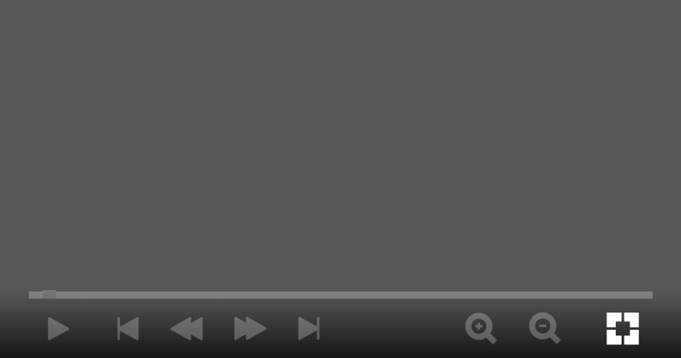
Control elements
The control elements and the navigation bar are primarily used to control your presentation channel and for orientation. The controls are based on the standard buttons familiar from the multimedia sector. Start or stop the presentation, switch to full screen, zoom or jump back and forth in the content.
Orientation
The navigation bar shows you the current position of the presentation. The length varies depending on the current component being displayed.
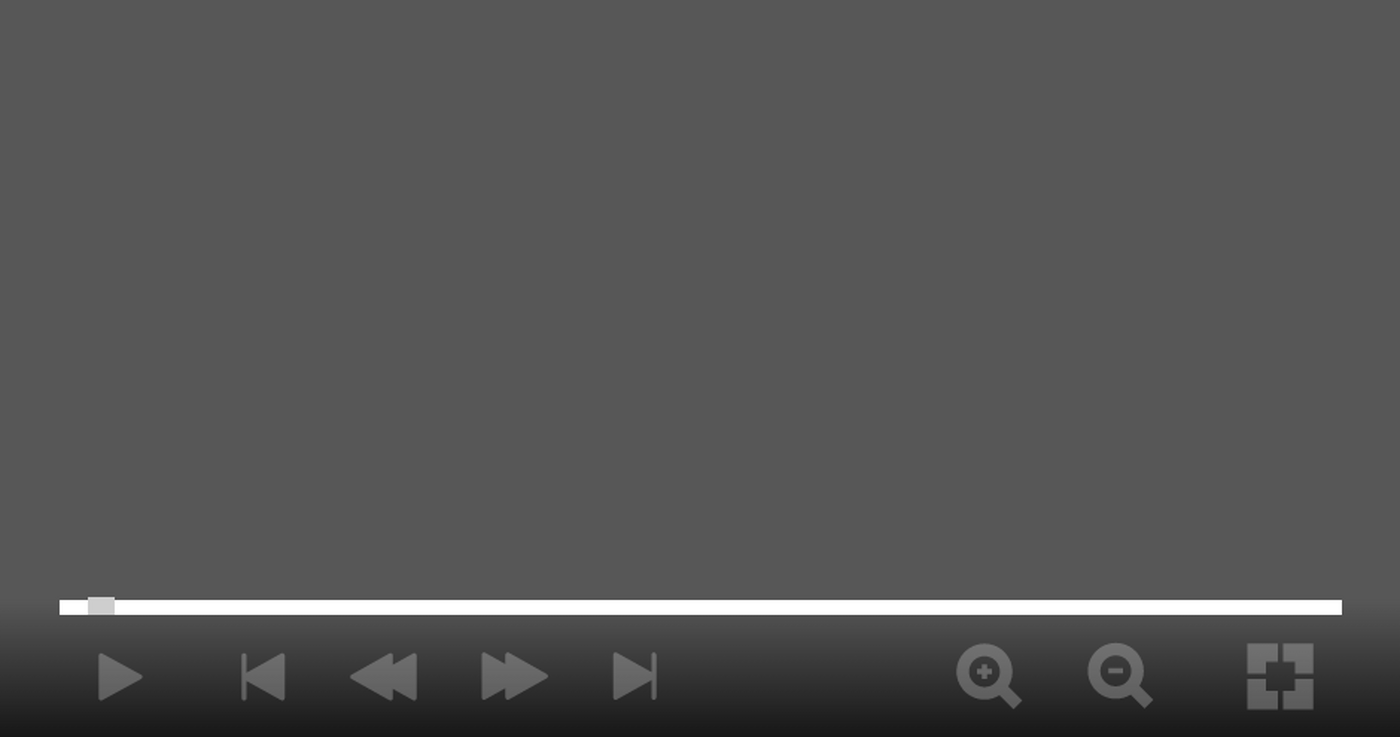
Navigation
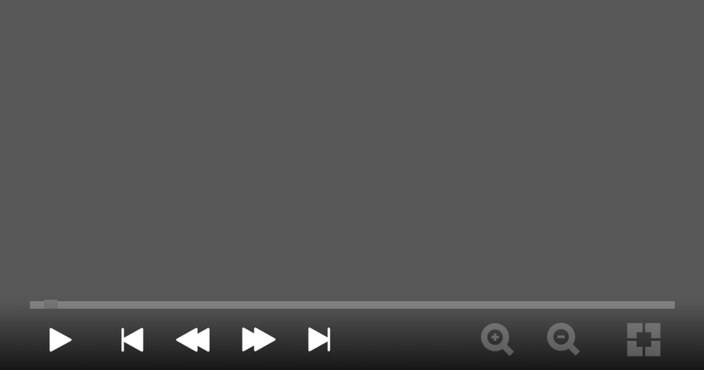
You can start and stop the presentation using the Play and Pause buttons. (This symbol changes depending on whether the presentation is currently running or has been paused) Alternatively, you can also use the space bar if a keyboard is connected.
You can use the triangles ending with a dash to switch between individual components, for example from menu to menu and skip all content elements of a component. Alternatively, you can also use the left and right arrow keys if a keyboard is connected.
Use the double triangles to switch to the next content element of a component. Alternatively, you can also use the up and down arrow keys if a keyboard is connected.
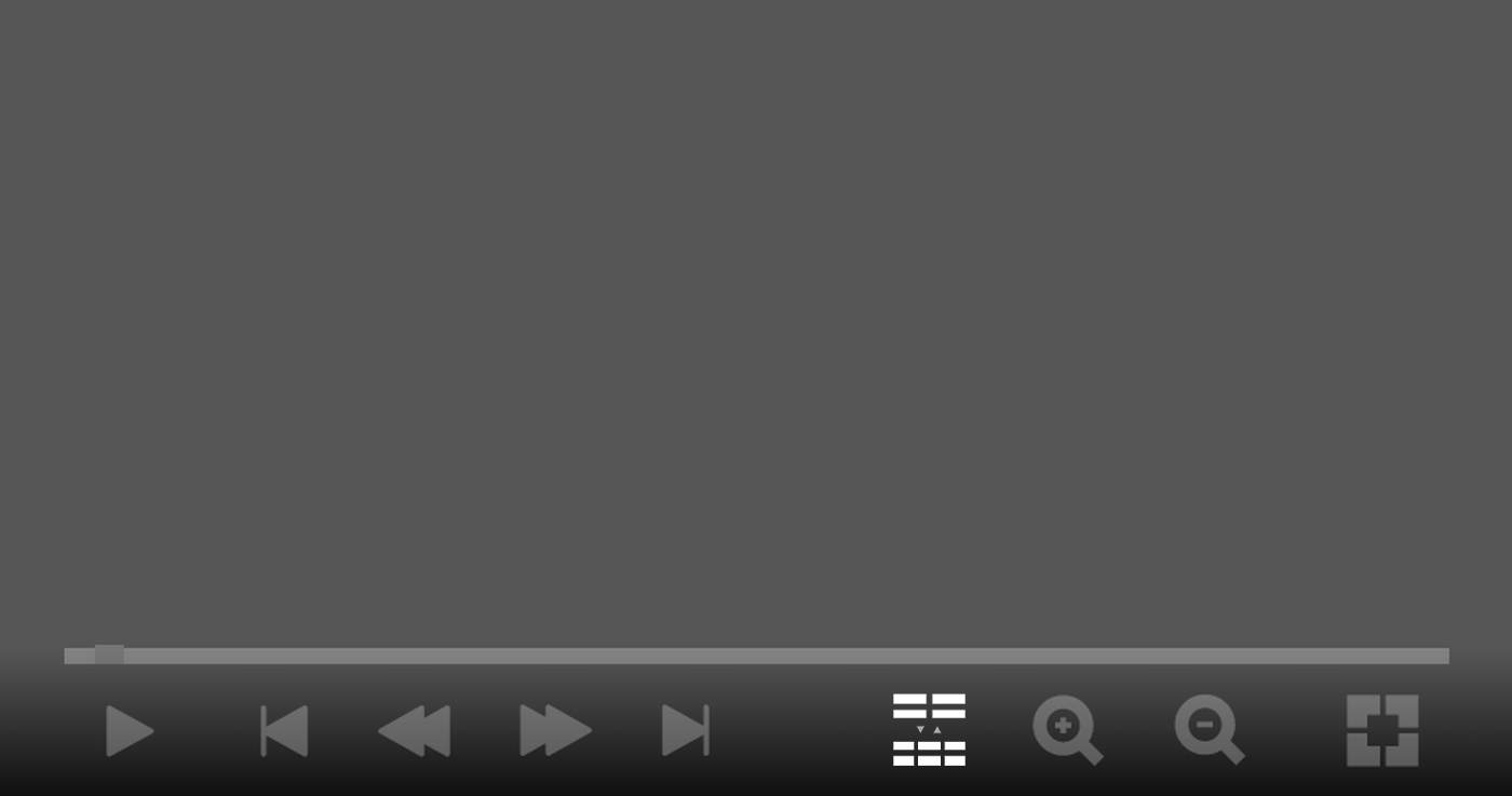
Switch columns
Switch between different 2-/3-column or 1-/2-column views - if the conditions for this are met (the ratio between screen width and height is greater than 1.5).
Zoom
For certain viewing distances or text lengths, it may be necessary to adjust the text and element size. To do this, use our predefined zoom levels by clicking/tapping on the magnifying glass with the minus symbol or plus symbol.
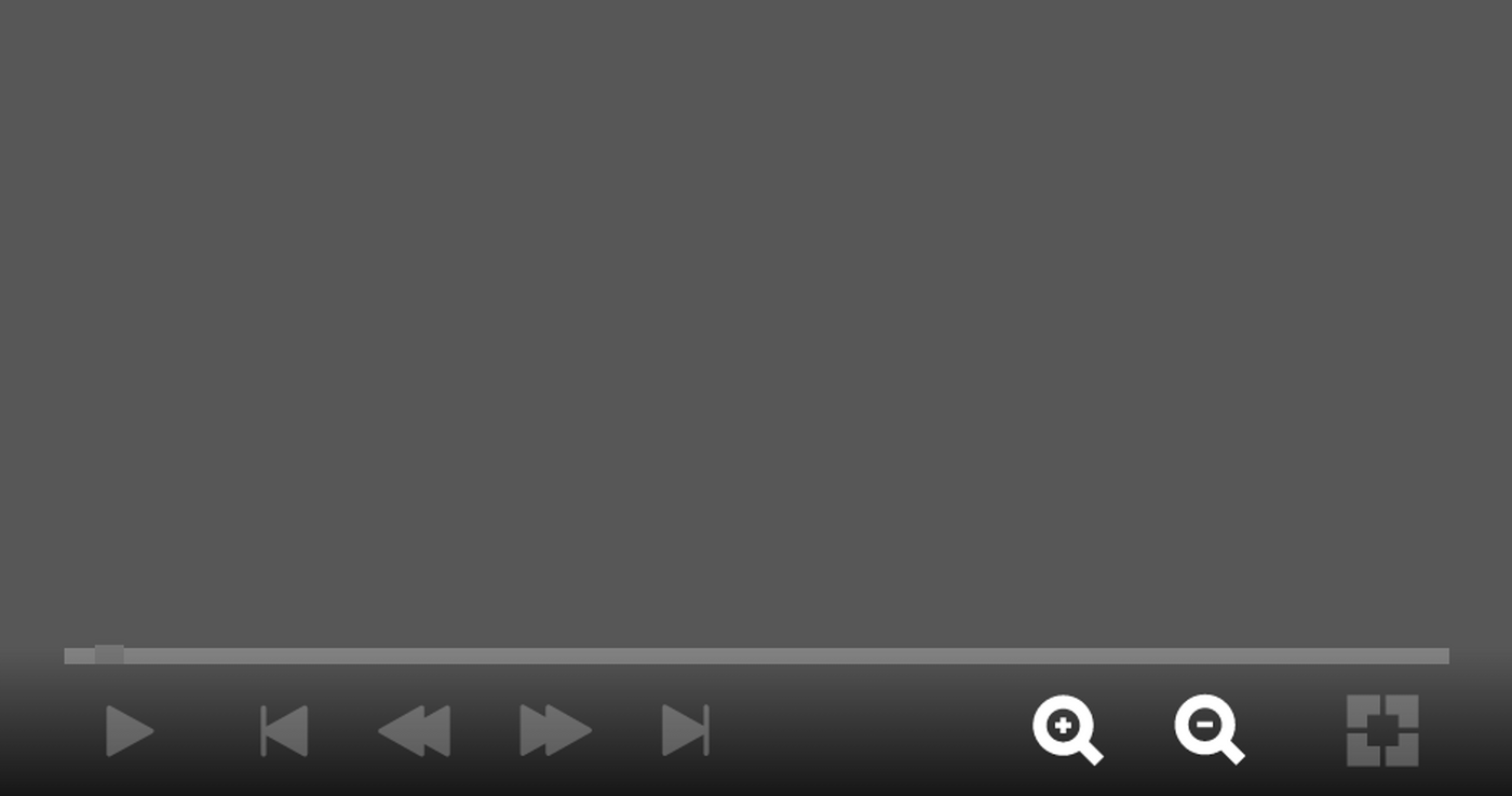
Full screen
To switch to full screen, use the button with the split square on the right. Click/tap again to switch back to the window view.